DESIGN SYSTEM
OVERVIEW
When I joined Strateos, the software was very primitive in its design and lacked an organized and unified design system. The goal was to start a new design system from the ground up and rebuild the Strateos platform. Before getting started, I gathered our product, design and engineering leads to discuss the scope of such a project. There, I uncovered a few roadblocks:
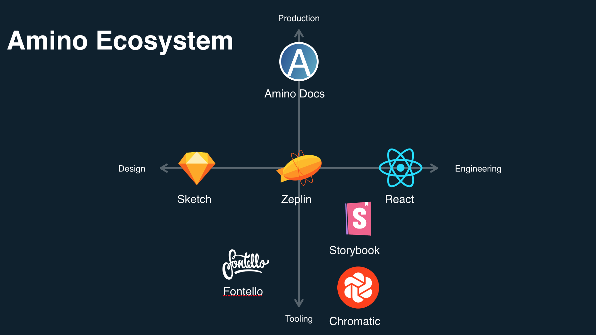
Our current tools (Sketch, InVision, Zeplin) didn’t allow for proper collaboration and made it difficult to manage our files effectively.
Each product was built independently by different teams creating an inconsistent user experience.
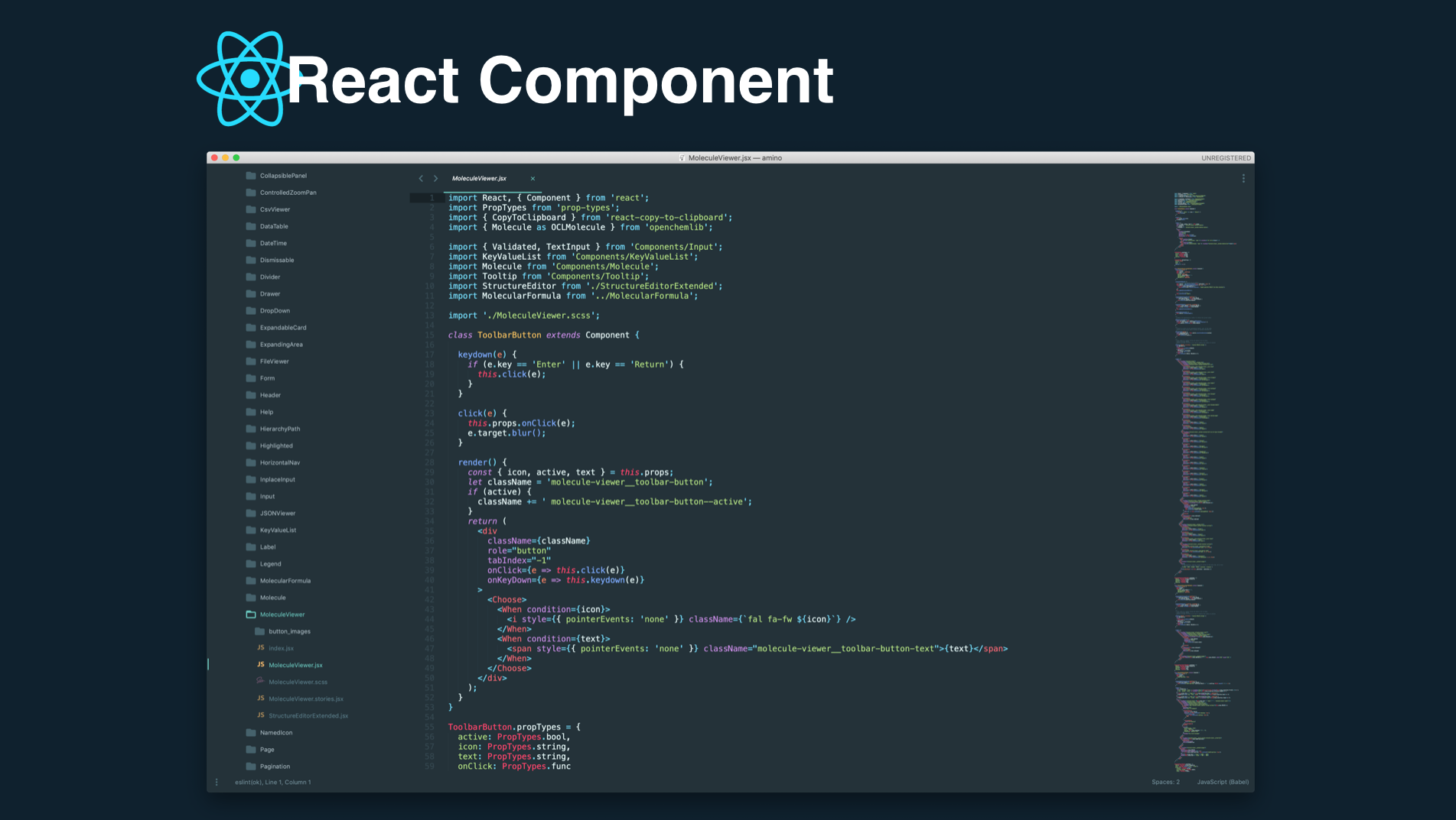
Our front-end components were not standardized and code was not reused or shared across products.
We lacked a unified design system that allowed design assets to be shared across teams.
We lacked processes to coordinate efforts between teams.
GOALS
Once I had a clear understanding of the underlying problems, I set out to define an action plan. I started by organizing and defining a set of key objectives to measure success for our new design system.
Switch to better tools to optimize our team’s workflow
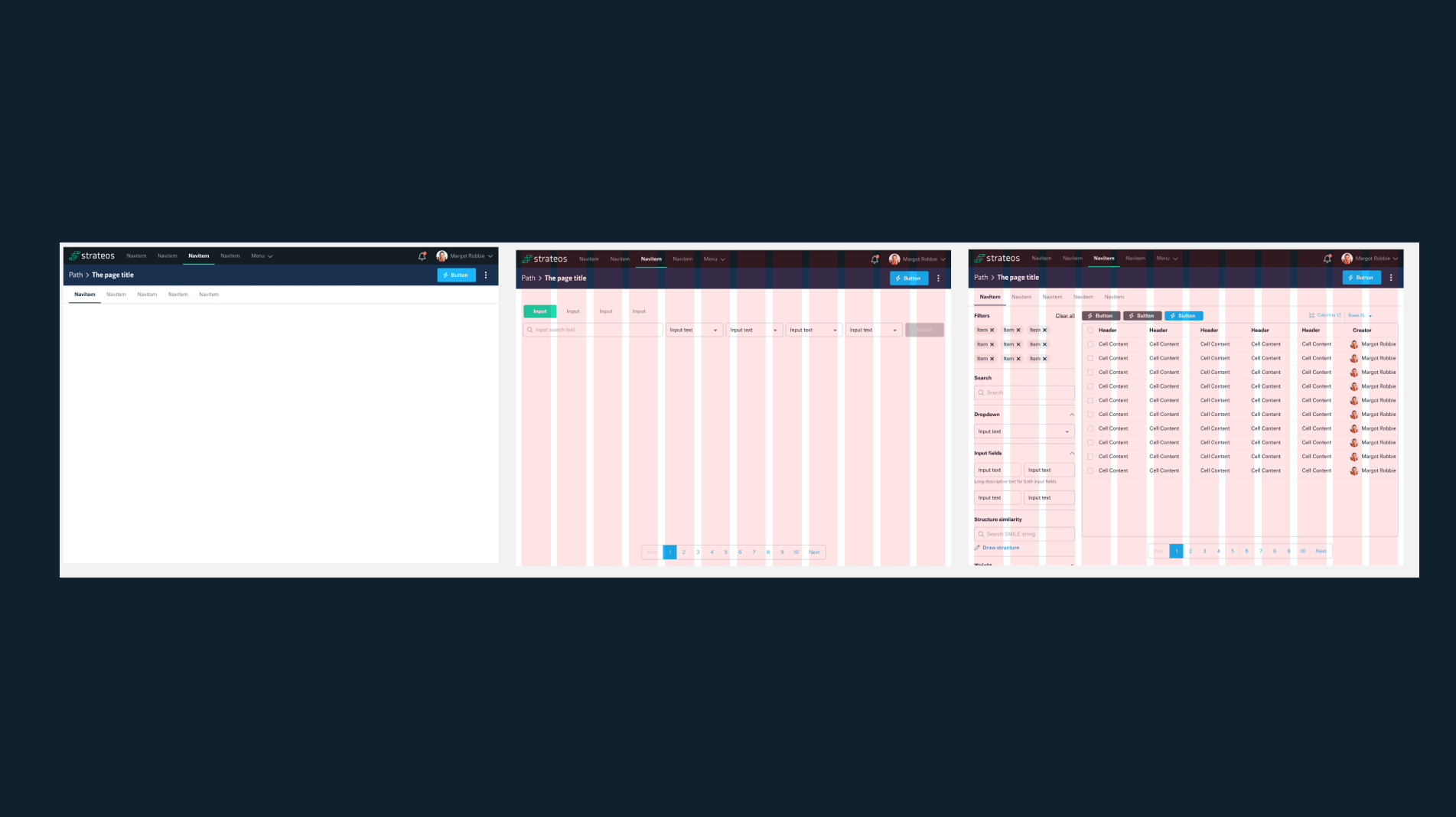
Design a new global navigation
Refresh the UI look-and-feel
Build a modular design system
Unify our front-end codebase
Legacy Design System (Where we started)
We began by auditing our existing design system, which was primitive, rigid and required constant workarounds. Our ecosystem of tools used for design and production needed optimization, so a zoom out approach of our process was necessary.



Industry Audit
Once we audited the current design system, we needed to audit other company platforms in our space to see what tools and experiences are being used see how we can implement some of the positive experiences into our platform and improving on ones we felt needed work.
Discovery
It was important for us to be able to define the overall experience in terms of patterns, principles, tone and voice. What did we want to be as a brand and how can we remain consistent to that brand.
I started a workshop with the design, marketing and executive team to align on what our values were and what we wanted to convey about our company through our design. Things such as whether we wanted our platform to be Formal vs Casual, Enthusiastic vs Matter of Fact, Funny vs Serious, were all taken into consideration when conducting this workshop.
Visual Design Explorations
We wanted to scrap everything we knew about the current Strateos platform and take the opportunity to think outside the box and not be conservative when thinking about what we would like the future our new platform. The overall goal was to improve the look and feel of the experience as a whole.
As a team, we got a feel for each others’ design styles and took bits and pieces from each design and incorporated them into our new Amino Design System.
Amino Design System 2.0
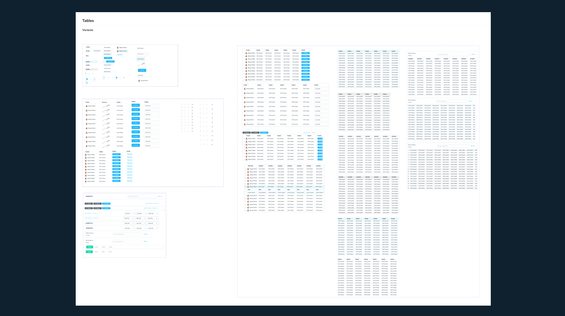
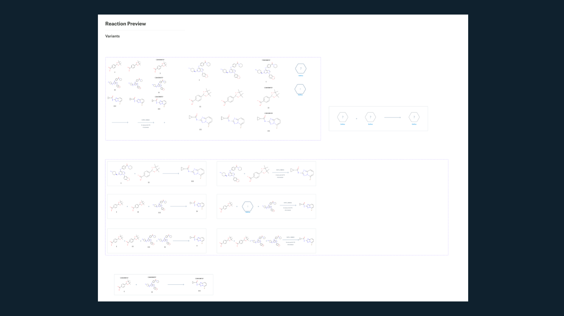
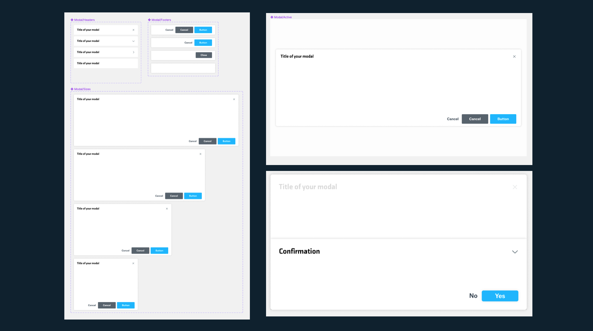
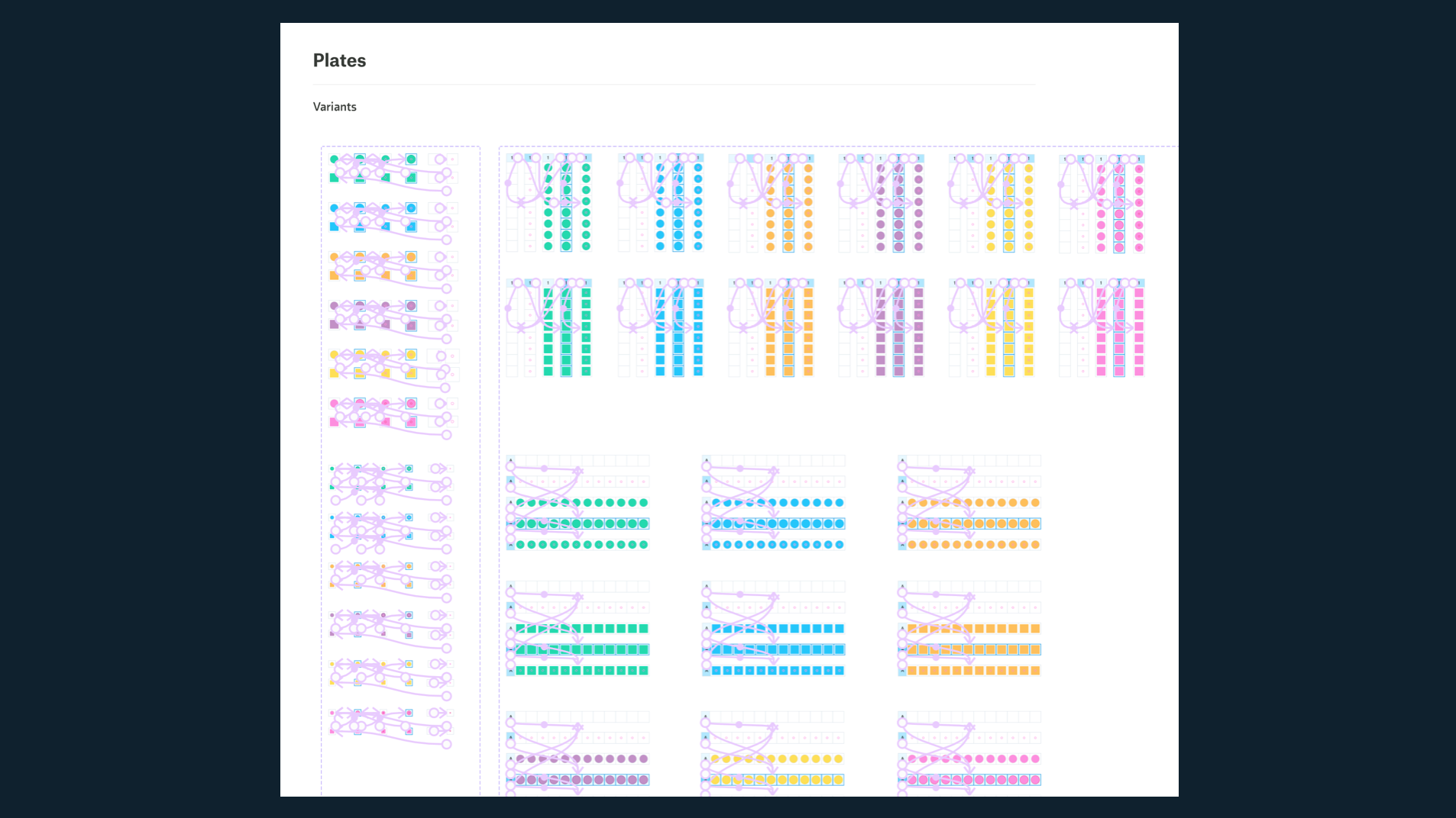
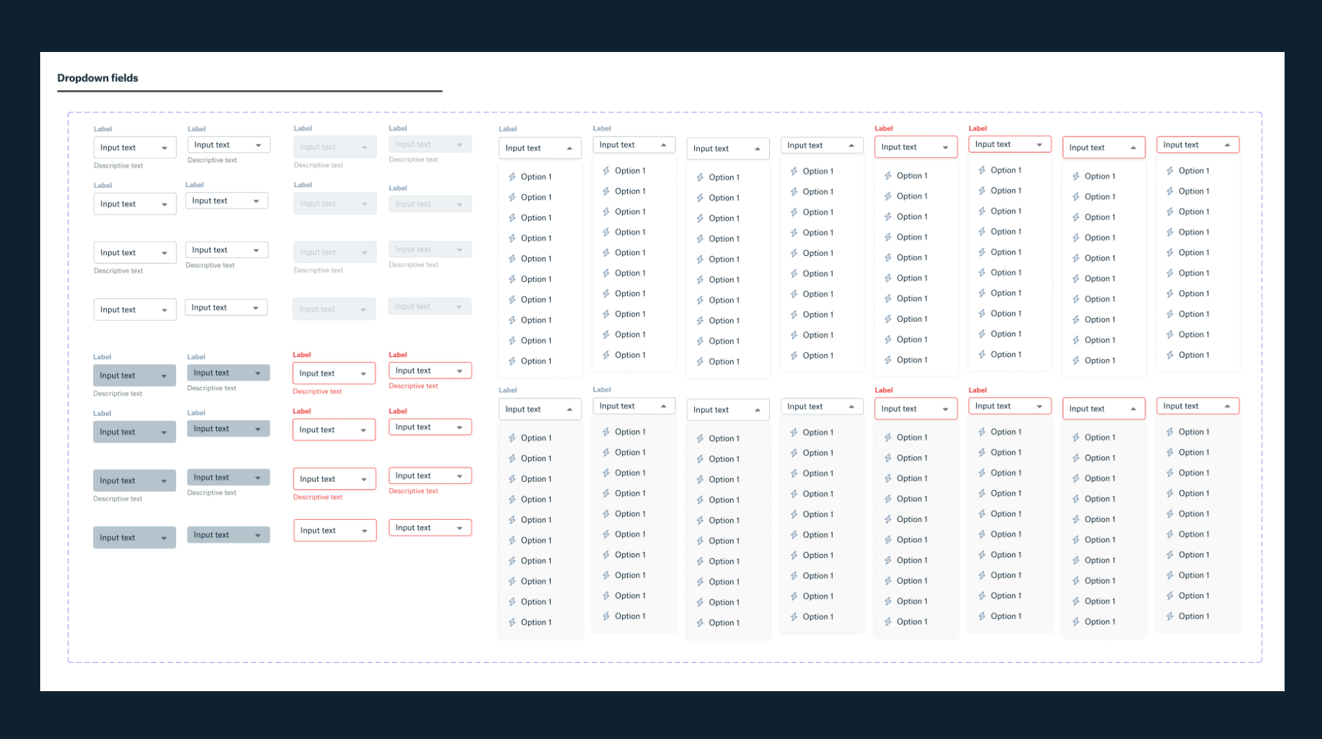
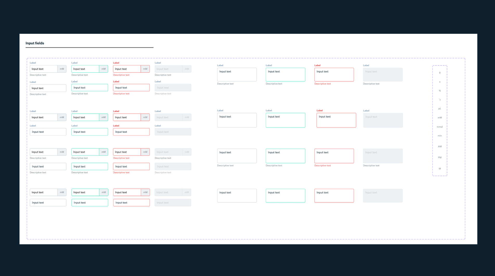
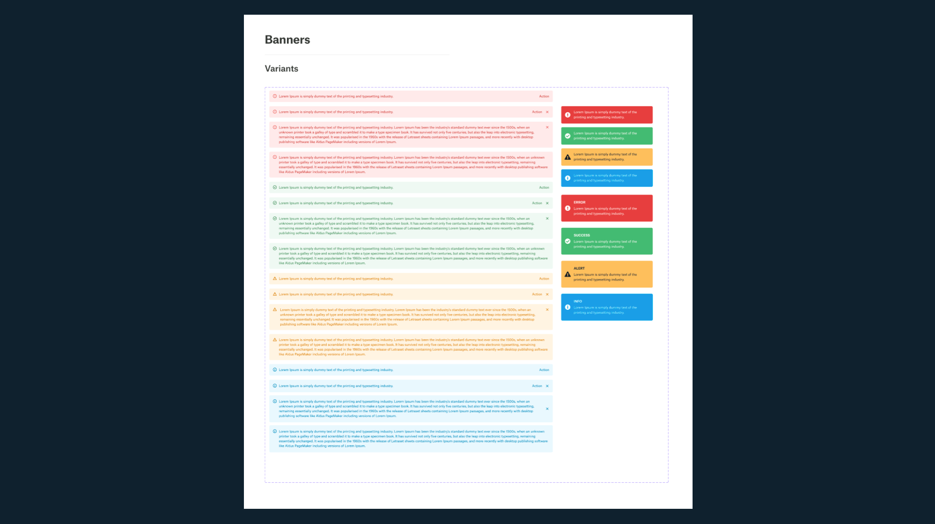
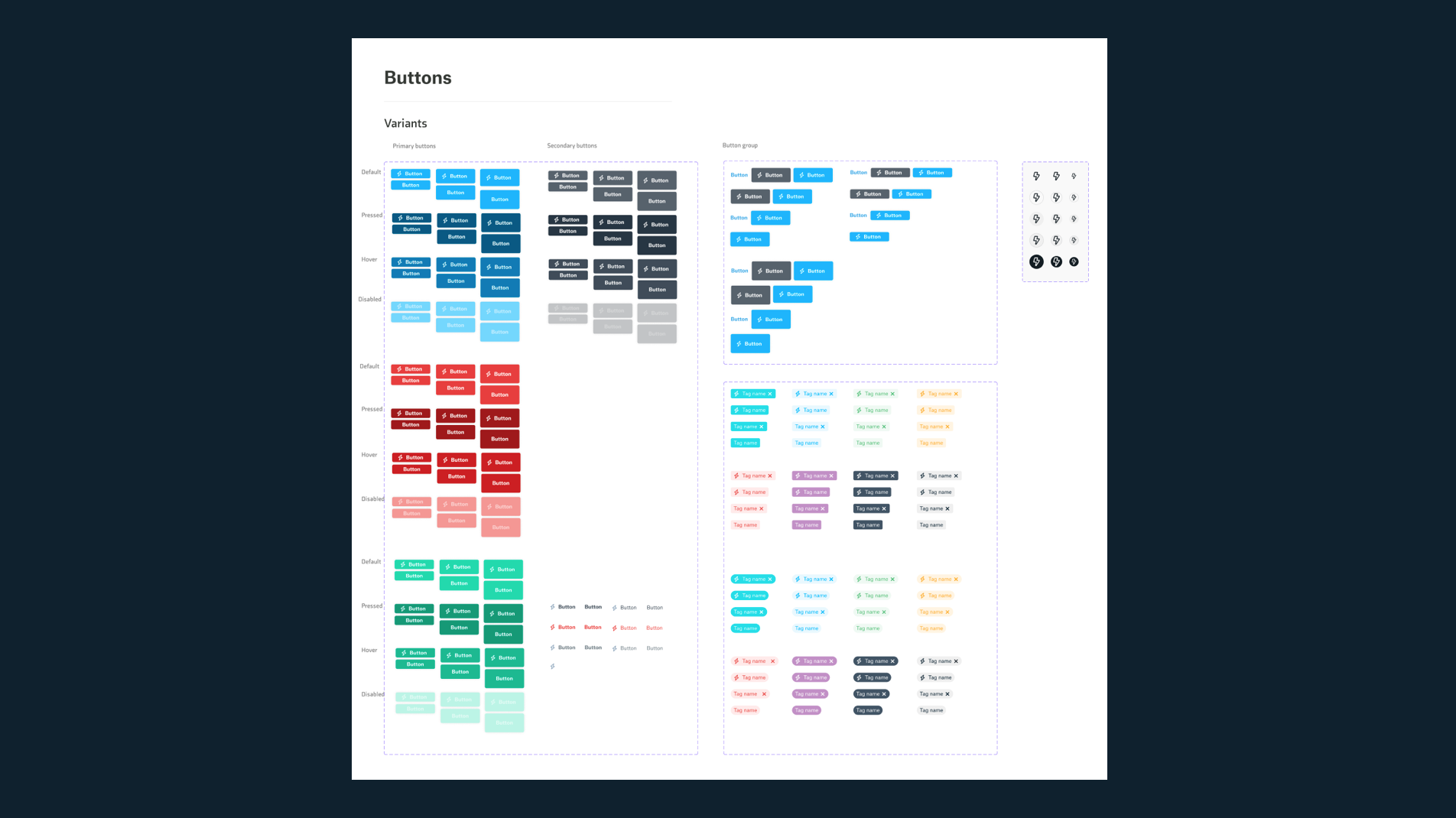
The process for designing our new components was iterative and went through many weeks to solidify our core components. I made sure that our components were sturdy in several regards:
Dynamic: In figma, I built the components with multiple variants for different use cases that the component would need to satisfy
Resusable: We didn’t want to create components that would be “one-offs”. The utility of the core components we built needed to be clear .
Polished: Creating the component correctly from the first time was ultimately the goal. Rarely in design is this the case, but using extensive research and spending a great deal of time polishing the component would help us reduce component updates in the future.


Design System Management
As the main point of contact for Amino, I was responsible for all things related to the design system. We needed a way to make sure that we maintained good hygiene with the design system and kept up to date with the progress. I was able to manage Amino with the following tools:
Component tracker: I created a confluence doc with table that highlighted the status of each section associated to the specific component such as the visual design, autolayout, prototype interaction, storybook build and documentation. Each was given a status of “Up to date” , “In progress” and “Not started”. This allowed for easier planning for amino heavy sprints and product roadmaps.
Data validation: In figma, we’re able to track certain metrics for our components. I made a concerted effort to bring data validation into the fold with out components, so things like number of detaches, number of inserts, and number of bugs would indicate to us what components are heavily used and which ones required constant modifications.
Component request form: To make sure we were only designing components that were going to be heavily used, I set up a process for requesting a component. This request could come from anyone on the product team. They would answer simple questions about the utility of the new component and where they referenced it from. I would then review the request and make decisions about whether to implement them or not.
Bulk Container Actions
OVERVIEW
Strateos is what we like to call a “Robotic cloud lab”. In plain English, the company has a bunch of labs that run chemistry and biology experiments fully automated by robots.
I came across a major painpoint in the workflow that did not involve the robots and that involved our on-site human scientists or “operators” as we call them. The operators are always on site making sure the robots are operating properly and can tend to any issues in the handoff process between machines. The painpoint that I discovered upon visiting the lab in Menlo Park, CA was that there were boxes and boxes of containers stacked up. When I asked what those containers were for, the operator told me that they were meant to be discarded and removed from the inventory from the software. They said that they typically take a long time to go through these boxes and manually “destroy” or dispose of them.
Research Phase
To get a better understanding of the problem at hand, I wanted to gather information from as many power users as possible. We have two locations, Menlo Park and San Diego. Both operate in unique ways, but I felt gathering info on both would be useful. I set up research sessions with each operator, which came out to roughly 8 in total, and asked for as much detail about the container destruction process as possible.
Next, I visited the lab again to have the operators walk me through the process in detail so I can visualize the workflow and ask questions that would be relevant to optimizing their workflow. I discovered that their barcode system was flawed. They used barcodes that typically had duplicates and were often unused. They also were not using the barcode scanner at all when it came to inputting the container in their inventory system. They would manually input the barcode number.
Brainstorm
I gathered all the information I could from the operators and began to brainstorm. I knew that we needed to start using the barcode scanner to allow them to quickly scan the barcodes into the system. However, there was no current way in the system to select a large number of containers that were scanned.
I consulted with some engineers and asked if there was a way we could do some sort of bulk action modal similar to a shopping experience where you scan your items and then take action on those items. There were some technical limitations at first, but ultimately we were able to come up with a way for it to work. I also needed to pitch. the idea to the design team and my PM to see if it was something we could even take up. After much deliberation, I was able to get the approval from all parties to begin working on some initial explorations so that I could pitch the idea to the team.
Iterations
I presented these initial wireframes to design team and received feedback regarding how this would be utilized in other parts of the application and for other bulk actions such as transferring containers, deleting containers and shipping containers. It was valid feedback and required some more brainstorming.
I needed to adjust the way this design worked in order to accommodate the other actions. I went discussed during our design sync sessions with others to bounce ideas off the other members of my team and we were able to strategize a way to include them all. Initially I had “transfer” and “destroy” in the modal itself; I figured that if I was able to use the main CTA to just submit the selections, they could go back to the inventory view and take the bulk actions directly from the table. That way they could also filter the selections from the inventory page.
Final design
After much back and forth and many sprints, we were able to ship the final designs. We received high praise from our operators about how this design has optimized their workflow and felt like “the most modern experience we have in the appication today”.
I would deem this project as one my largest accomplishments at the company to date and loved working through the ups and downs this project had to offer. Seeing how our users interact with the application and use this bulk destruction feature on a day to day basis really made the process worth it. We optimized the operators’ workflow and cut down on much of the time they would be spending doing manual inputs and destruction.


